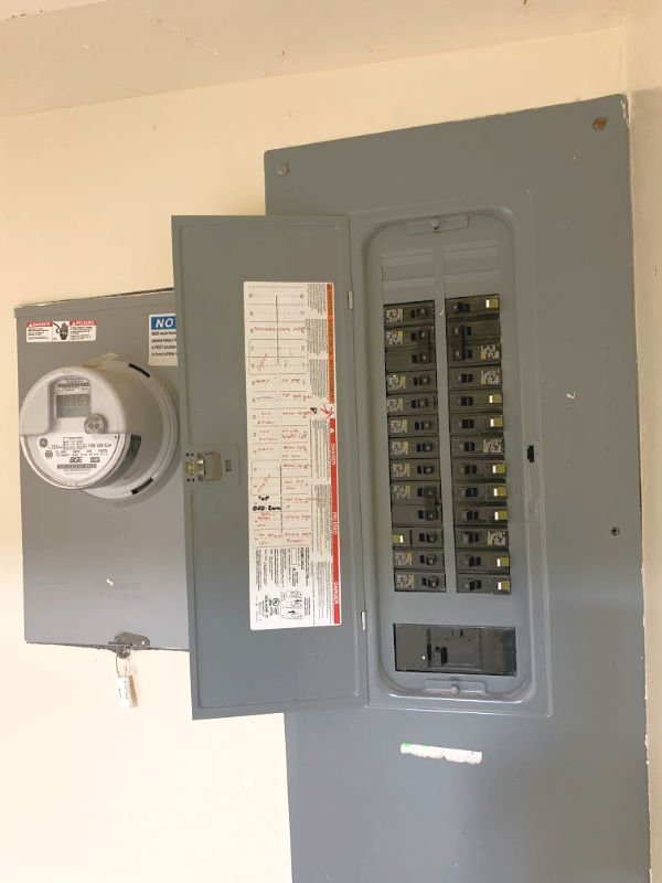
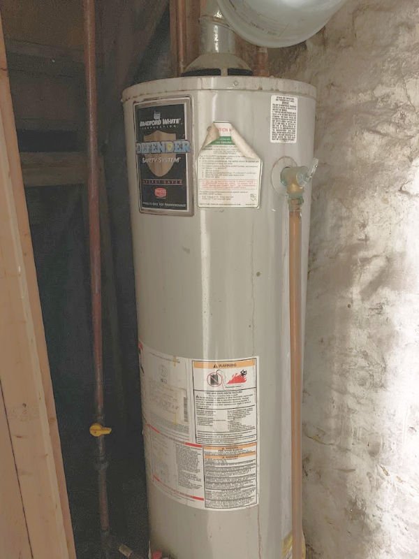
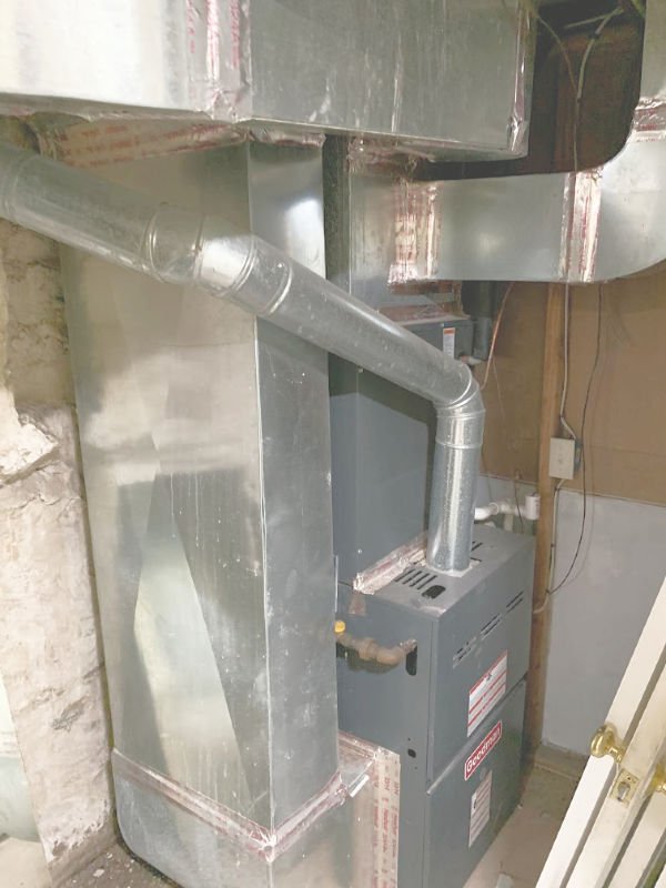
Additional Features
96
*|MC:SUBJECT|*
p{
margin:10px 0;
padding:0;
}
table{
border-collapse:collapse;
}
h1,h2,h3,h4,h5,h6{
display:block;
margin:0;
padding:0;
}
img,a img{
border:0;
height:auto;
outline:none;
text-decoration:none;
}
body,#bodyTable,#bodyCell{
height:100%;
margin:0;
padding:0;
width:100%;
}
.mcnPreviewText{
display:none !important;
}
#outlook a{
padding:0;
}
img{
-ms-interpolation-mode:bicubic;
}
table{
mso-table-lspace:0pt;
mso-table-rspace:0pt;
}
.ReadMsgBody{
width:100%;
}
.ExternalClass{
width:100%;
}
p,a,li,td,blockquote{
mso-line-height-rule:exactly;
}
a[href^=tel],a[href^=sms]{
color:inherit;
cursor:default;
text-decoration:none;
}
p,a,li,td,body,table,blockquote{
-ms-text-size-adjust:100%;
-webkit-text-size-adjust:100%;
}
.ExternalClass,.ExternalClass p,.ExternalClass td,.ExternalClass div,.ExternalClass span,.ExternalClass font{
line-height:100%;
}
a[x-apple-data-detectors]{
color:inherit !important;
text-decoration:none !important;
font-size:inherit !important;
font-family:inherit !important;
font-weight:inherit !important;
line-height:inherit !important;
}
#bodyCell{
padding:10px;
}
.templateContainer{
max-width:600px !important;
}
a.mcnButton{
display:block;
}
.mcnImage,.mcnRetinaImage{
vertical-align:bottom;
}
.mcnTextContent{
word-break:break-word;
}
.mcnTextContent img{
height:auto !important;
}
.mcnDividerBlock{
table-layout:fixed !important;
}
body,#bodyTable{
background-color:#FAFAFA;
}
#bodyCell{
border-top:0;
}
.templateContainer{
border:0;
}
h1{
color:#202020;
font-family:Helvetica;
font-size:26px;
font-style:normal;
font-weight:bold;
line-height:125%;
letter-spacing:normal;
text-align:left;
}
h2{
color:#202020;
font-family:Helvetica;
font-size:22px;
font-style:normal;
font-weight:bold;
line-height:125%;
letter-spacing:normal;
text-align:left;
}
h3{
color:#202020;
font-family:Helvetica;
font-size:20px;
font-style:normal;
font-weight:bold;
line-height:125%;
letter-spacing:normal;
text-align:left;
}
h4{
color:#202020;
font-family:Helvetica;
font-size:18px;
font-style:normal;
font-weight:bold;
line-height:125%;
letter-spacing:normal;
text-align:left;
}
#templatePreheader{
background-color:#FAFAFA;
background-image:none;
background-repeat:no-repeat;
background-position:center;
background-size:cover;
border-top:0;
border-bottom:0;
padding-top:9px;
padding-bottom:9px;
}
#templatePreheader .mcnTextContent,#templatePreheader .mcnTextContent p{
color:#656565;
font-family:Helvetica;
font-size:12px;
line-height:150%;
text-align:left;
}
#templatePreheader .mcnTextContent a,#templatePreheader .mcnTextContent p a{
color:#656565;
font-weight:normal;
text-decoration:underline;
}
#templateHeader{
background-color:#FFFFFF;
background-image:none;
background-repeat:no-repeat;
background-position:center;
background-size:cover;
border-top:0;
border-bottom:0;
padding-top:9px;
padding-bottom:0;
}
#templateHeader .mcnTextContent,#templateHeader .mcnTextContent p{
color:#202020;
font-family:Helvetica;
font-size:16px;
line-height:150%;
text-align:left;
}
#templateHeader .mcnTextContent a,#templateHeader .mcnTextContent p a{
color:#007C89;
font-weight:normal;
text-decoration:underline;
}
#templateBody{
background-color:#FFFFFF;
background-image:none;
background-repeat:no-repeat;
background-position:center;
background-size:cover;
border-top:0;
border-bottom:2px solid #EAEAEA;
padding-top:0;
padding-bottom:9px;
}
#templateBody .mcnTextContent,#templateBody .mcnTextContent p{
color:#202020;
font-family:Helvetica;
font-size:16px;
line-height:150%;
text-align:left;
}
#templateBody .mcnTextContent a,#templateBody .mcnTextContent p a{
color:#007C89;
font-weight:normal;
text-decoration:underline;
}
#templateFooter{
background-color:#FAFAFA;
background-image:none;
background-repeat:no-repeat;
background-position:center;
background-size:cover;
border-top:0;
border-bottom:0;
padding-top:9px;
padding-bottom:9px;
}
#templateFooter .mcnTextContent,#templateFooter .mcnTextContent p{
color:#656565;
font-family:Helvetica;
font-size:12px;
line-height:150%;
text-align:center;
}
#templateFooter .mcnTextContent a,#templateFooter .mcnTextContent p a{
color:#656565;
font-weight:normal;
text-decoration:underline;
}
@media only screen and (min-width:768px){
.templateContainer{
width:600px !important;
}
} @media only screen and (max-width: 480px){
body,table,td,p,a,li,blockquote{
-webkit-text-size-adjust:none !important;
}
} @media only screen and (max-width: 480px){
body{
width:100% !important;
min-width:100% !important;
}
} @media only screen and (max-width: 480px){
#bodyCell{
padding-top:10px !important;
}
} @media only screen and (max-width: 480px){
.mcnRetinaImage{
max-width:100% !important;
}
} @media only screen and (max-width: 480px){
.mcnImage{
width:100% !important;
}
} @media only screen and (max-width: 480px){
.mcnCartContainer,.mcnCaptionTopContent,.mcnRecContentContainer,.mcnCaptionBottomContent,.mcnTextContentContainer,.mcnBoxedTextContentContainer,.mcnImageGroupContentContainer,.mcnCaptionLeftTextContentContainer,.mcnCaptionRightTextContentContainer,.mcnCaptionLeftImageContentContainer,.mcnCaptionRightImageContentContainer,.mcnImageCardLeftTextContentContainer,.mcnImageCardRightTextContentContainer,.mcnImageCardLeftImageContentContainer,.mcnImageCardRightImageContentContainer{
max-width:100% !important;
width:100% !important;
}
} @media only screen and (max-width: 480px){
.mcnBoxedTextContentContainer{
min-width:100% !important;
}
} @media only screen and (max-width: 480px){
.mcnImageGroupContent{
padding:9px !important;
}
} @media only screen and (max-width: 480px){
.mcnCaptionLeftContentOuter .mcnTextContent,.mcnCaptionRightContentOuter .mcnTextContent{
padding-top:9px !important;
}
} @media only screen and (max-width: 480px){
.mcnImageCardTopImageContent,.mcnCaptionBottomContent:last-child .mcnCaptionBottomImageContent,.mcnCaptionBlockInner .mcnCaptionTopContent:last-child .mcnTextContent{
padding-top:18px !important;
}
} @media only screen and (max-width: 480px){
.mcnImageCardBottomImageContent{
padding-bottom:9px !important;
}
} @media only screen and (max-width: 480px){
.mcnImageGroupBlockInner{
padding-top:0 !important;
padding-bottom:0 !important;
}
} @media only screen and (max-width: 480px){
.mcnImageGroupBlockOuter{
padding-top:9px !important;
padding-bottom:9px !important;
}
} @media only screen and (max-width: 480px){
.mcnTextContent,.mcnBoxedTextContentColumn{
padding-right:18px !important;
padding-left:18px !important;
}
} @media only screen and (max-width: 480px){
.mcnImageCardLeftImageContent,.mcnImageCardRightImageContent{
padding-right:18px !important;
padding-bottom:0 !important;
padding-left:18px !important;
}
} @media only screen and (max-width: 480px){
.mcpreview-image-uploader{
display:none !important;
width:100% !important;
}
} @media only screen and (max-width: 480px){
h1{
font-size:22px !important;
line-height:125% !important;
}
} @media only screen and (max-width: 480px){
h2{
font-size:20px !important;
line-height:125% !important;
}
} @media only screen and (max-width: 480px){
h3{
font-size:18px !important;
line-height:125% !important;
}
} @media only screen and (max-width: 480px){
h4{
font-size:16px !important;
line-height:150% !important;
}
} @media only screen and (max-width: 480px){
.mcnBoxedTextContentContainer .mcnTextContent,.mcnBoxedTextContentContainer .mcnTextContent p{
font-size:14px !important;
line-height:150% !important;
}
} @media only screen and (max-width: 480px){
#templatePreheader{
display:block !important;
}
} @media only screen and (max-width: 480px){
#templatePreheader .mcnTextContent,#templatePreheader .mcnTextContent p{
font-size:14px !important;
line-height:150% !important;
}
} @media only screen and (max-width: 480px){
#templateHeader .mcnTextContent,#templateHeader .mcnTextContent p{
font-size:16px !important;
line-height:150% !important;
}
} @media only screen and (max-width: 480px){
#templateBody .mcnTextContent,#templateBody .mcnTextContent p{
font-size:16px !important;
line-height:150% !important;
}
} @media only screen and (max-width: 480px){
#templateFooter .mcnTextContent,#templateFooter .mcnTextContent p{
font-size:14px !important;
line-height:150% !important;
}
}
*|MC_PREVIEW_TEXT|*<!--
|
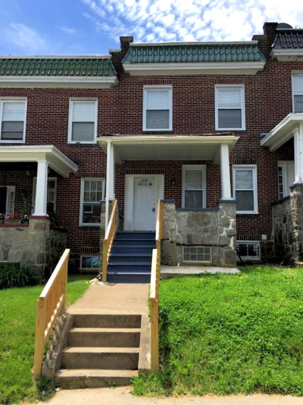
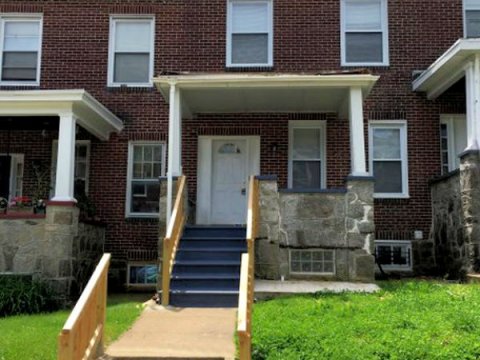
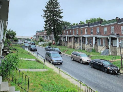
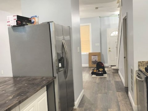
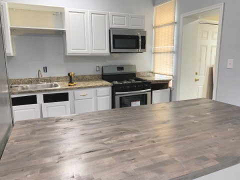
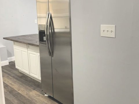
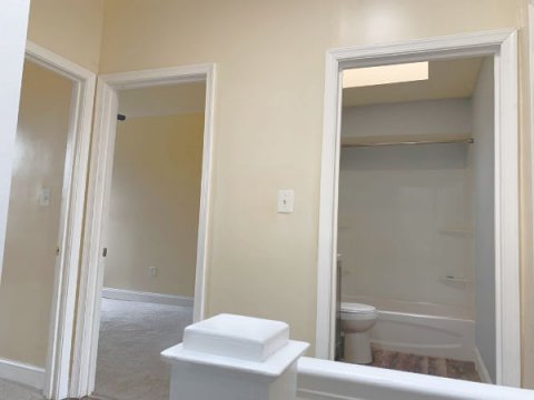
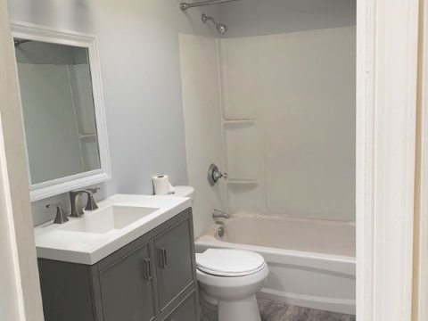
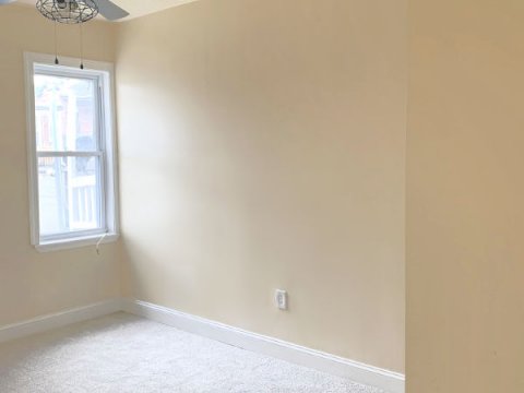
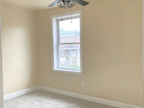
537 Chateau Ave, Baltimore, MD 21212
5br/2ba
ROI: 17.62%
Income Analysis
Listing Price: $119,900
Rental income: $1600/mo
Current Annual Taxes: $1921
Estimated Annual Insurance: $600
Estimated Annual Maintenance Costs: $1,600
** This estimate is based on any potential repairs the property may need over the course of a year. In our experience, this number is typically lower, but we always estimate on the high side.
Annual Property Management: $1,920
**The fee is 10% of the monthly rent.
Annual Net Rental Income: $19,200
Annual Cumulative Hard Costs: $6,041
Adjusted Gross Annual Income: $13,159
5 Year Return: $65,795
10 Year Return: $131,590
Renovated Comps:
722 McCabe Ave - sold 01/19 for $135k
515 Winston Ave - for sale for $146k
514 Winston Ave - sold 04/18 for $134k
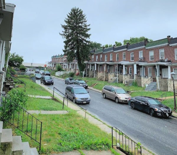
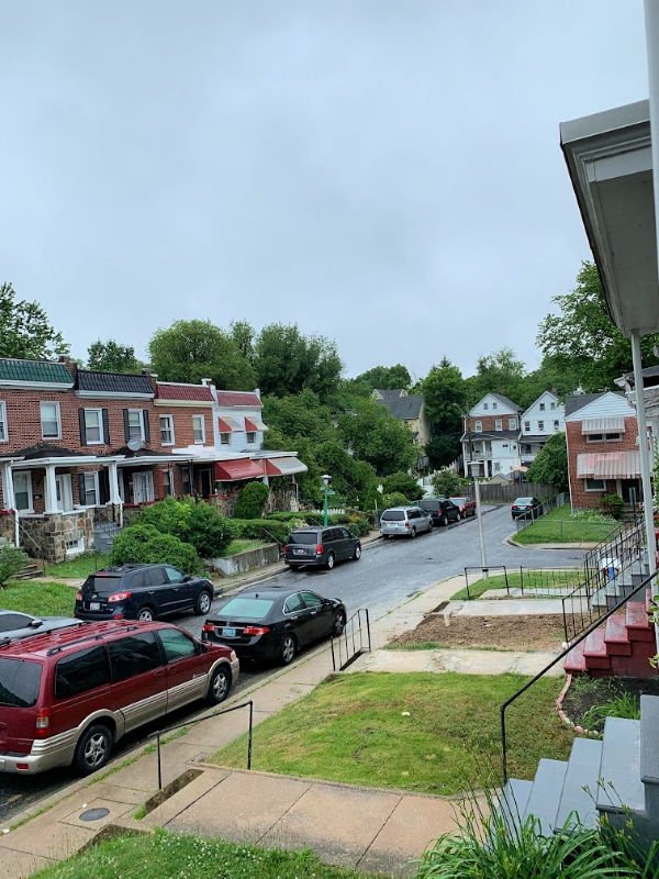
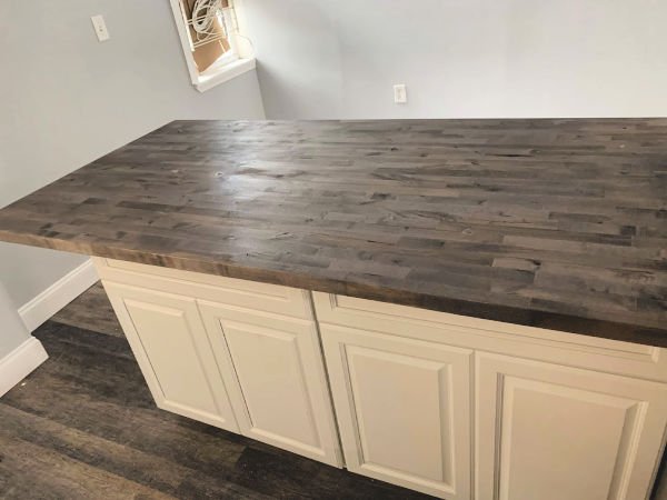
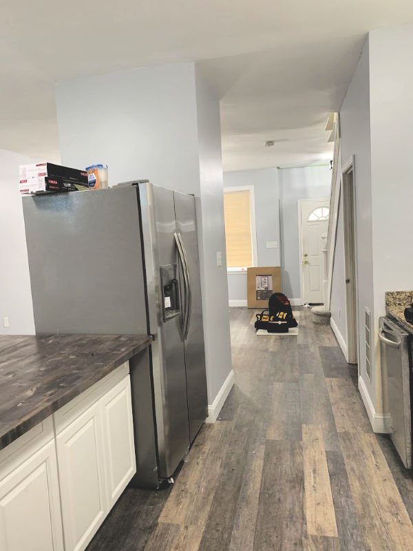
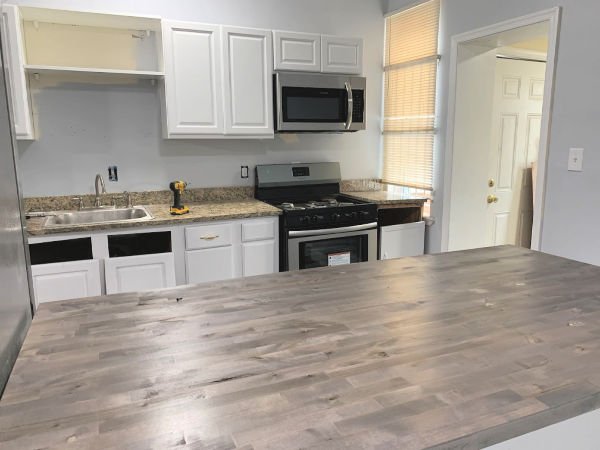
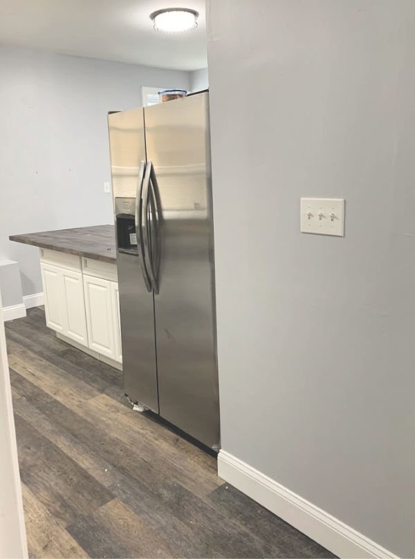
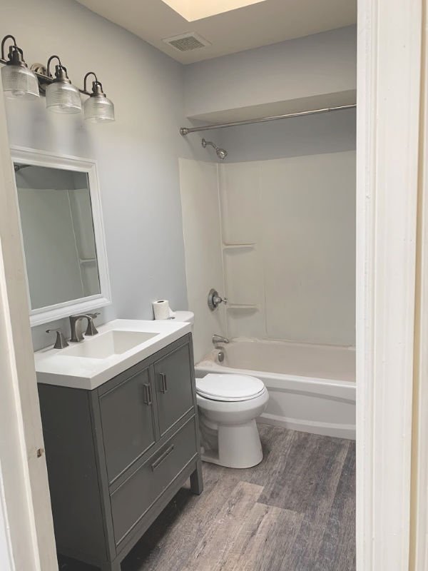
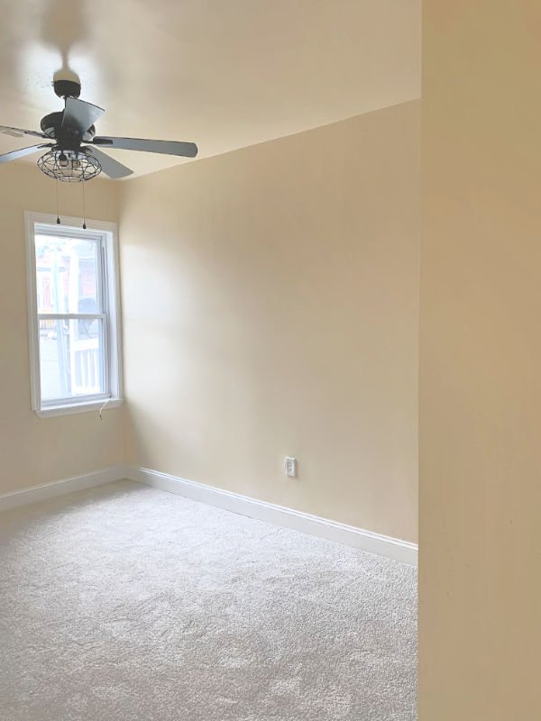
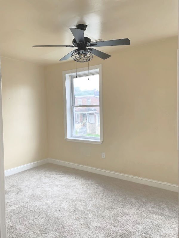
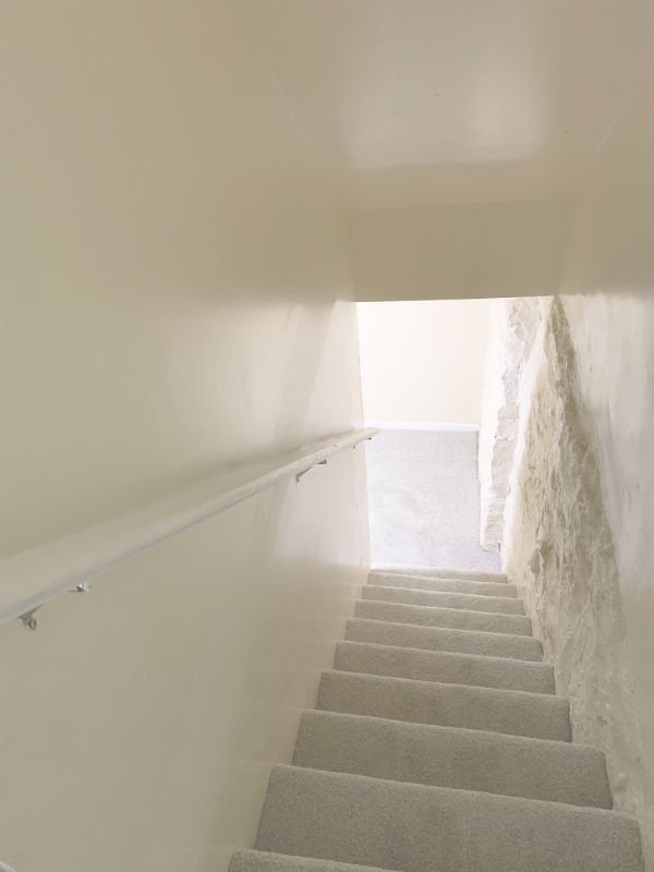
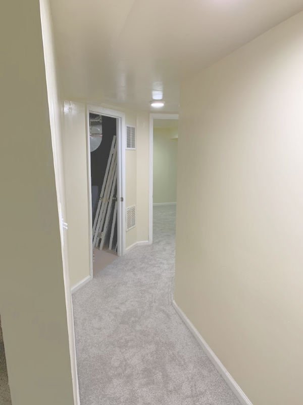
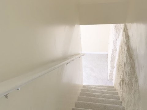
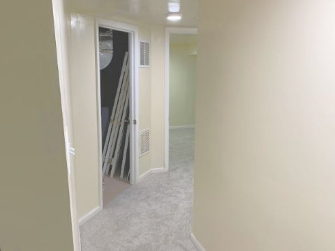
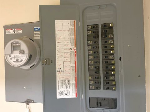
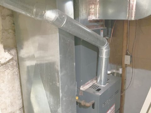
Property and Area Photos
|
|
|
|
More About Radnor-Winston Community
|
|
|
|
Radnor-Winston ZIP codes: 21212
Radnor Winston is a friendly, affordable and diverse neighborhood tucked behind the campuses of Loyola College and The College of Notre Dame. Radnor-Winston has been a historic district on the National Register of Historic Places since 2003. The Radnor Winston Improvement Association is an active volunteer organization with a long history of activism on local issues of concern. Radnor Winston is one of a number of early suburban communities developed along the York Road street car line in the early decades of the 20th century, built on land where there had previously been a number of large country estates. The Radnor-Winston Improvement Association was formed in 1958.
|
|
|
|
|
|